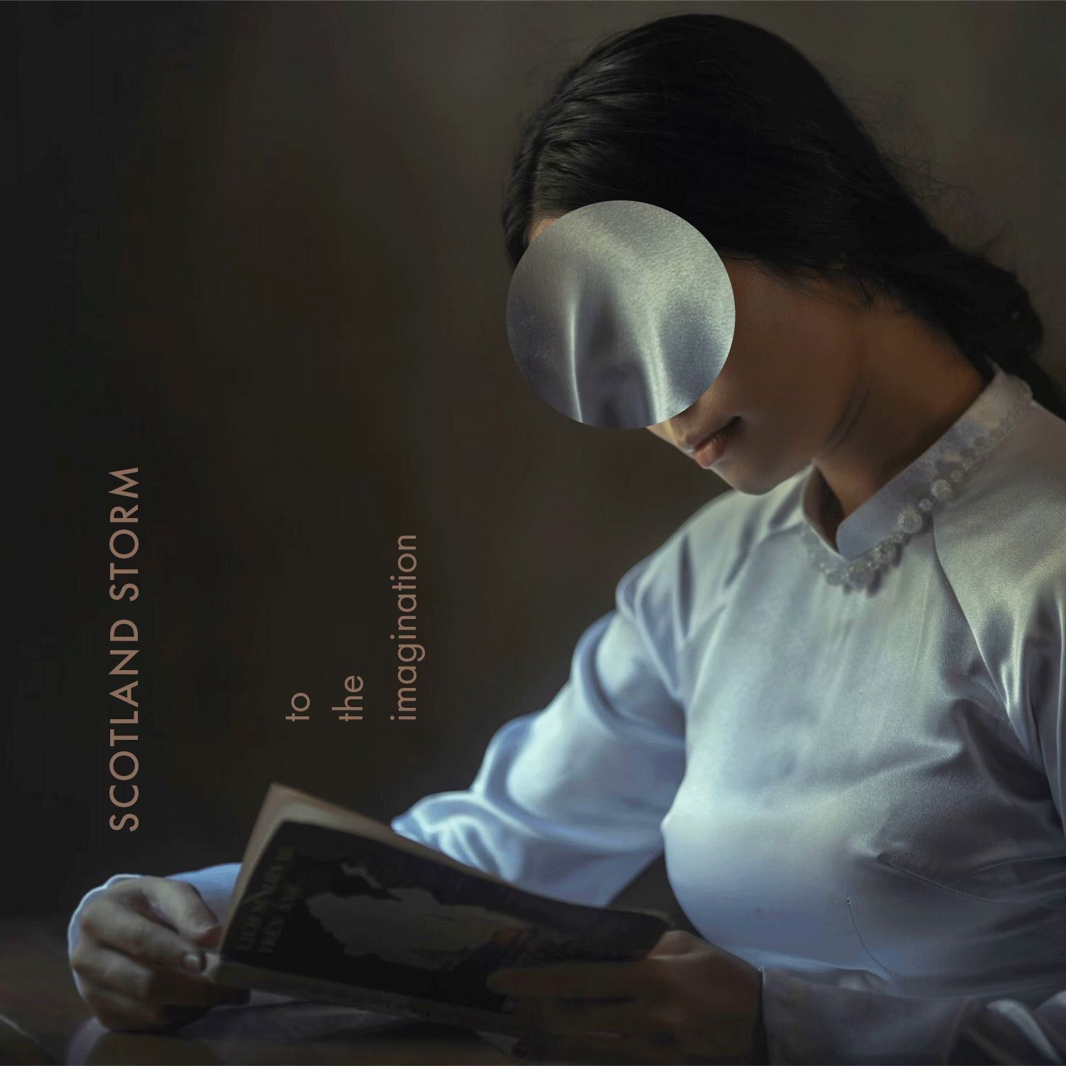
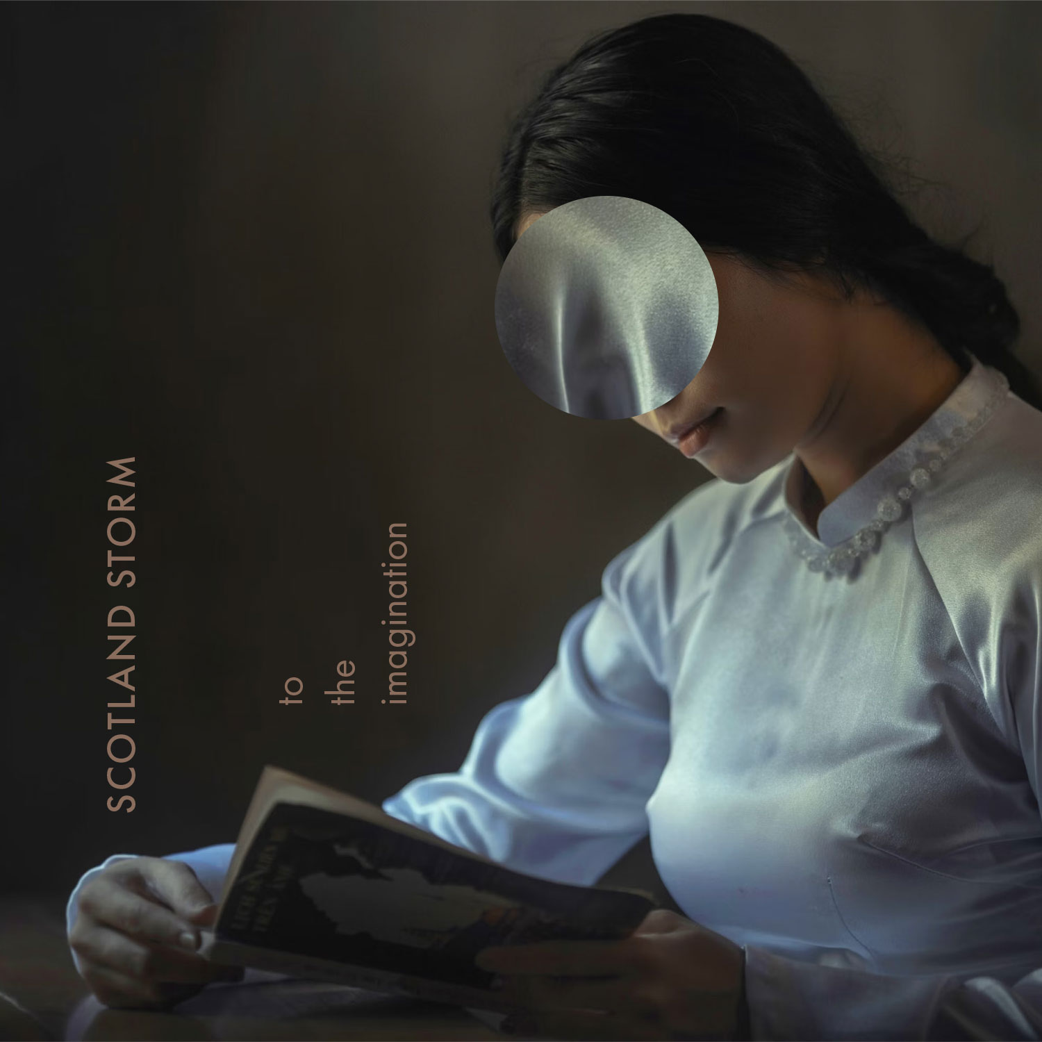
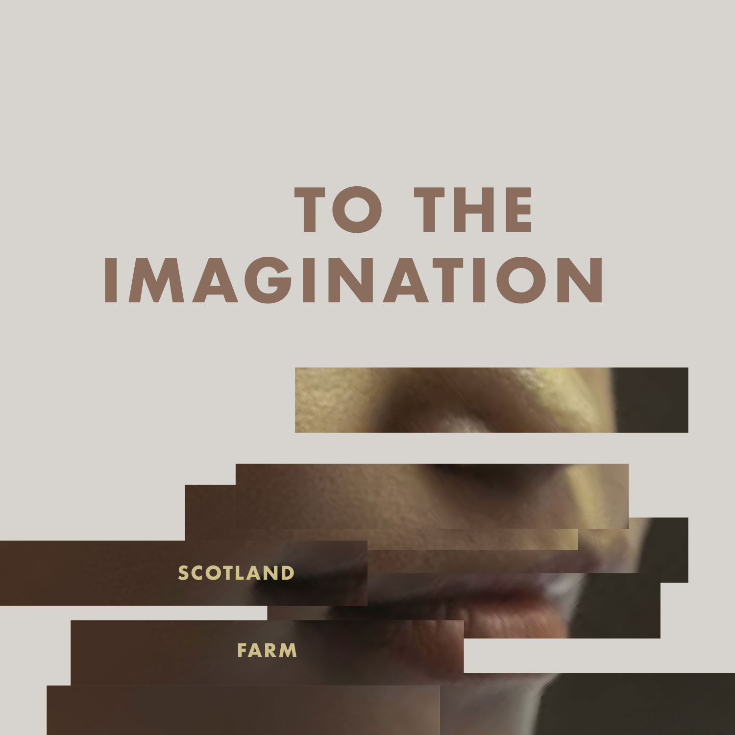
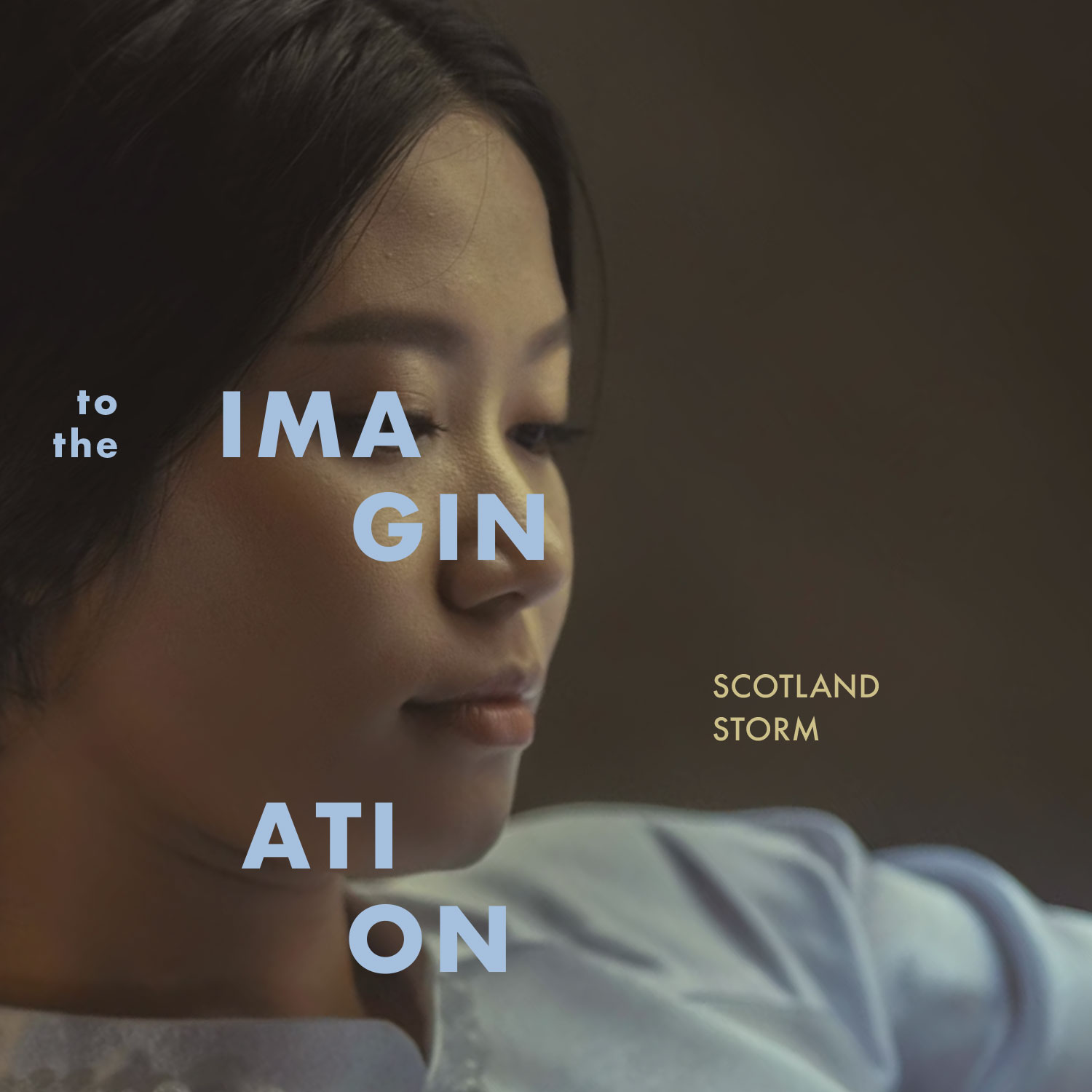
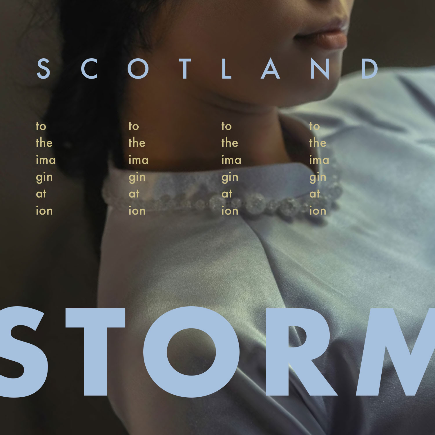
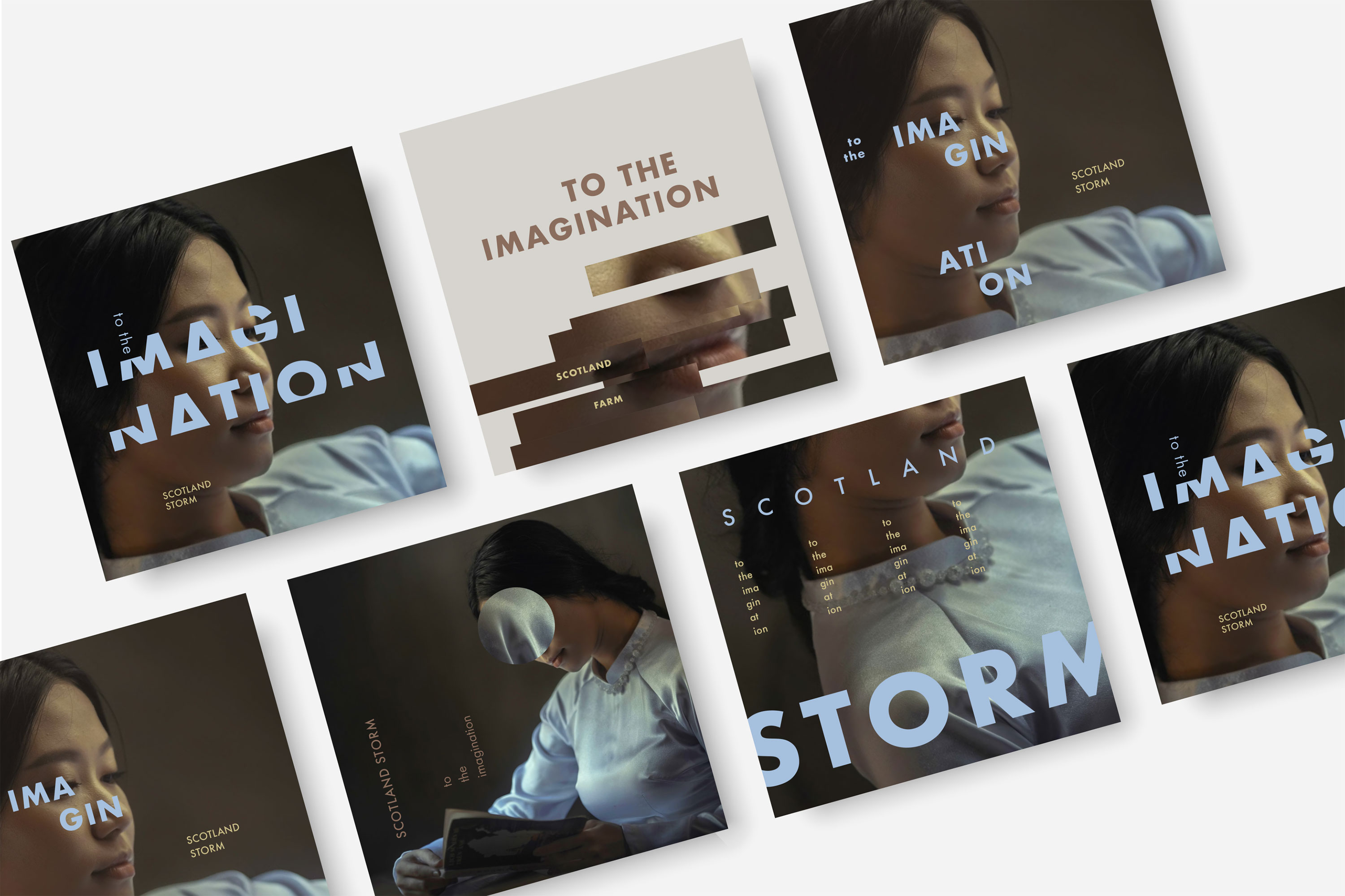
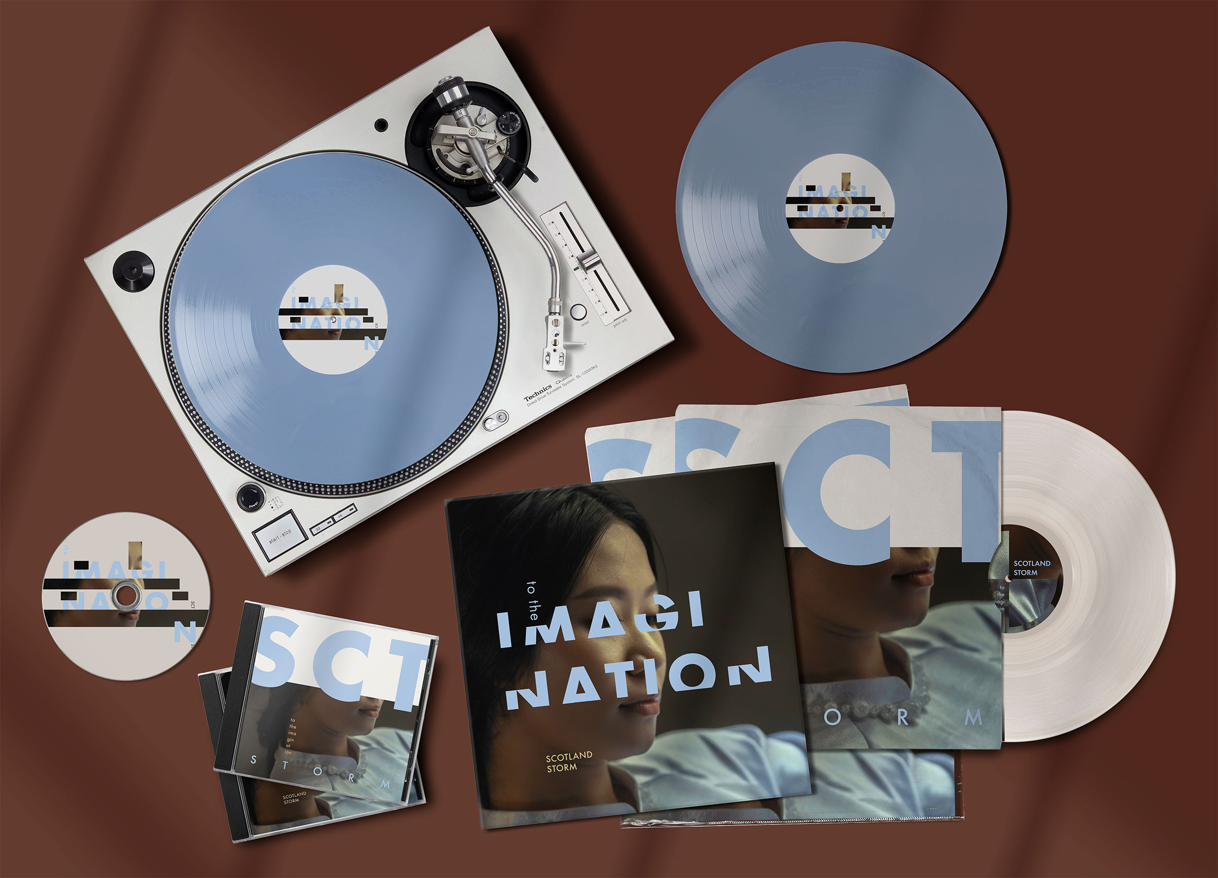
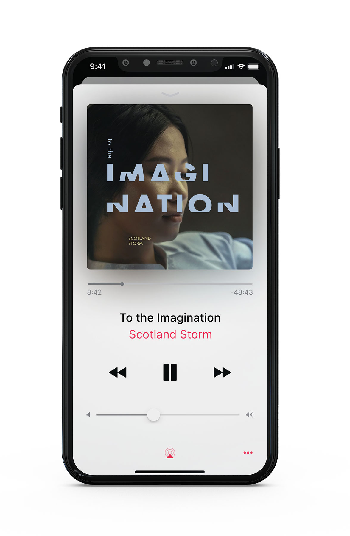
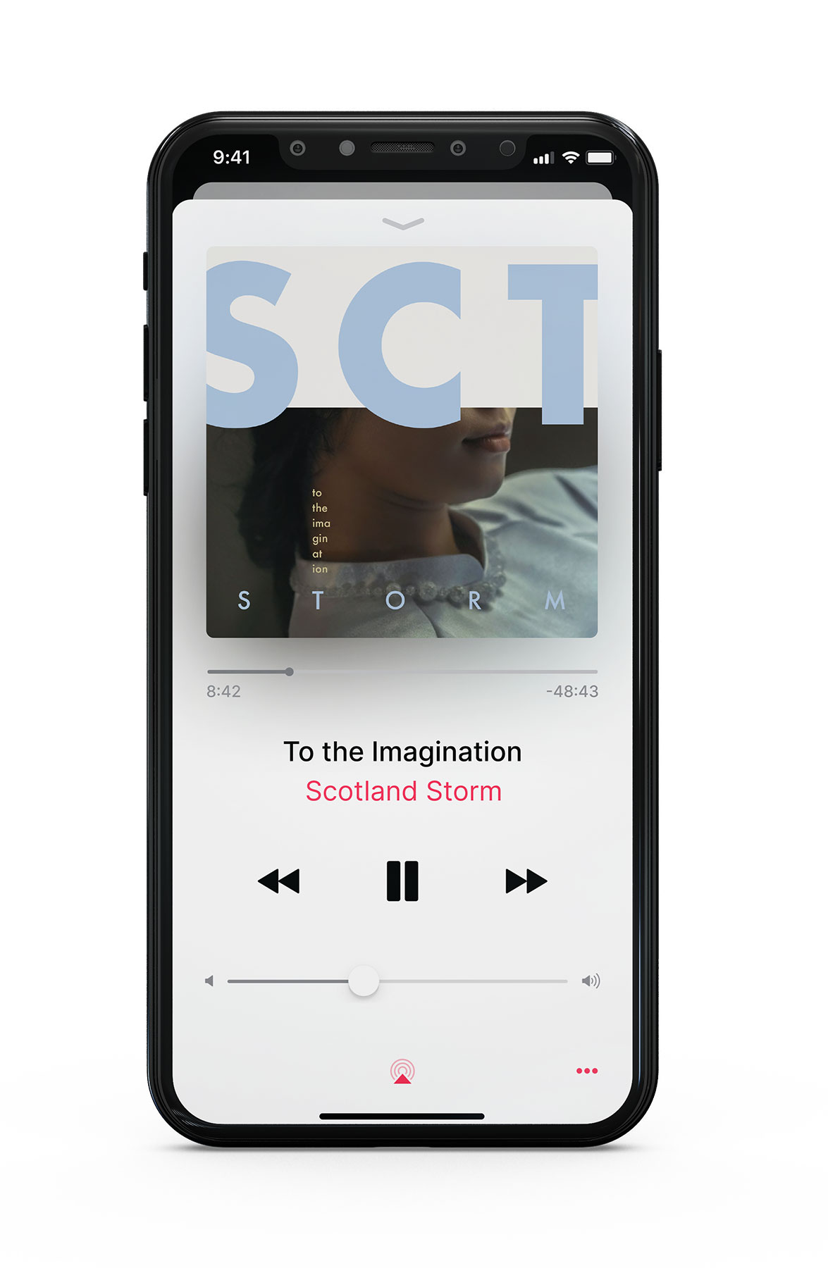
Two rows of different album cover options. The rows are tilted at an angle.

To the Imagination

ALBUM DESIGN

I designed a series of album covers with the limitation of randomly generated content.

I challenged myself to create diverse designs from the same image while maintaining a sense of unity through color and typography.

Drawing inspiration from the album's name, I intentionally cropped and covered identifying features of the face – especially the eyes – to create a sense of mystery.

A gif containing different design iterations of an album cover. The designs utilize an image of an Asian lady wearing a blue dress and a beautiful necklace, along with the words 'To the Imagination' and 'Scotland Storm'.
Version one. The lady's face is obscured by a circular cut out. The title of the album and the band name is rotated ninety-degrees counter-clockwise and placed near the bottom left.
Version two. Horizontal strips cut and paste together reveal just the bottom half of the lady's face. The album's title runs across the top of the composition and the band's name is placed near her mouth.
Version three. This time, more of the lady's face is revealed but the title of the album has been broken up to obscure parts of her face, such as her right eye and part of her nose and chin.
Version four. The image has been cropped so that the lady is seen just from her shoulder to her lips. The word 'storm' takes up much of the bottom half of the composition in bold, capital letters.
A few of the album designs are mocked-up onto an assortment of CDs and vinyl records on a warm, brown-red background.
A version of the album design is mocked-up onto the Apple Music app playing from an iPhone.
A second version of the album design mocked-up in the same way.