Work
Accessibility research • Packaging
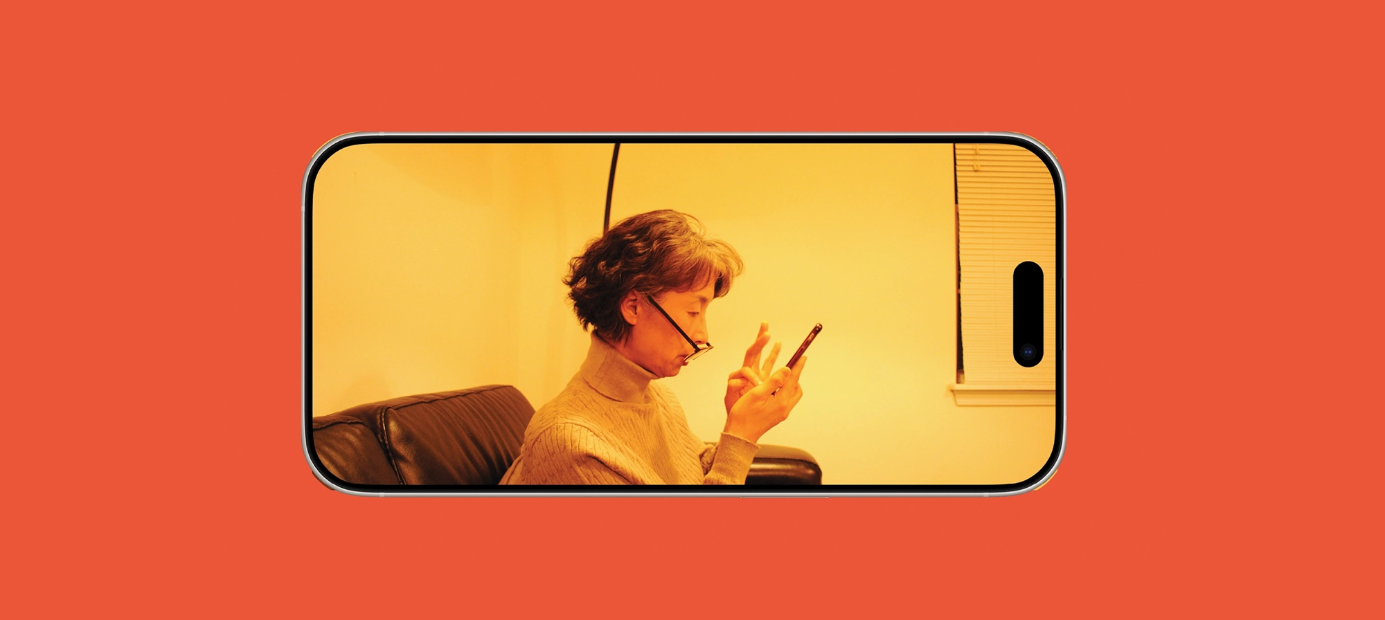
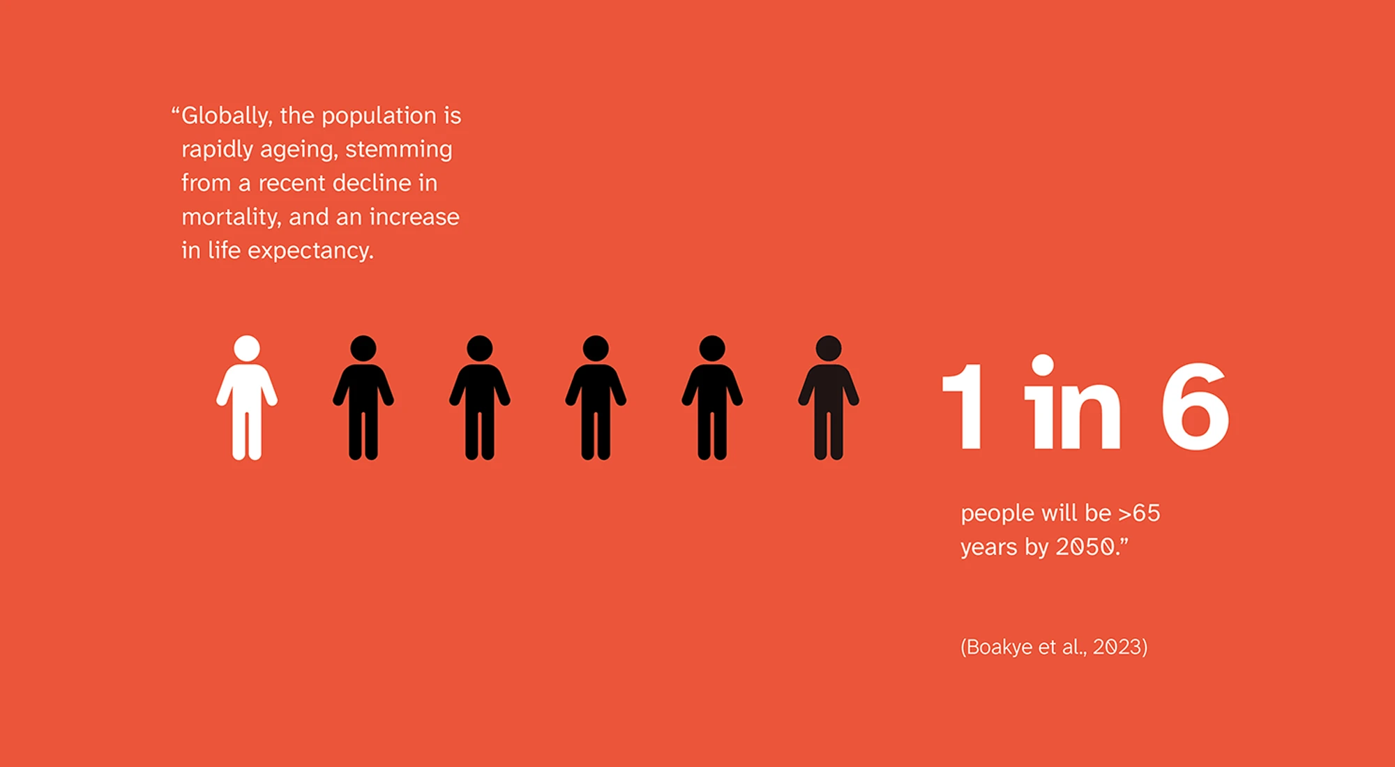
Middle-aged adults experiencing presbyopia would benefit from an increase in text size or bolded text, but the stigma associated with vision change and age leads this age group to reject the use of accessible settings.
This design research seeks to reframe vision change and age in a more positive light to provide agency and empowerment. The ultimate goal is to increase the adoption of accessibility settings.

My research began with my mom: she had been experiencing presbyopia for the past few years, but it wasn't until recently that she changed her phone settings. It completely changed her experience with her phone, yet no one in my family had thought of it sooner.
The more research I did, the more it confirmed to me that my mom’s story was just one of so many others.


My primary research focused on in-depth interviews and observational studies. There were three main takeaways:


This lead me to realize that the conversation about aging, accessibility, and smartphones goes beyond the realm of digital screens.
There’s a need for a shift in how we frame the idea of aging and disability, and this begins with family, friends, and close circles of community.
To better build joy and excitement, I reframed the idea of customizing your phone as a premium experience.


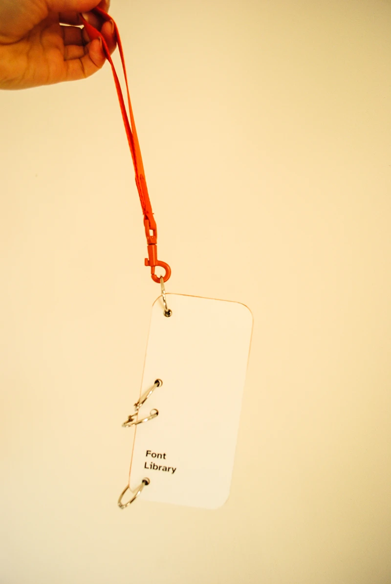
I created a font library of every possible font size (for iOS), including bold weights for easy comparison.
To make the packaging more accessible, I included a ribbon pull tab and added a lanyard on the booklet.


Phone packaging provides a great opportunity to reframe ideas of aging and accessibility, so I designed the pamphlet insert to be able to fit into smartphone boxes. The insert provides instruction for using the font book and includes context about presbyopia.
I focused on creating representation and agency through tone-of-voice and imagery.

Smartphones have become a means to live in a world that is increasingly more and more digitized. The possibilities of customizing your phone exactly to your preferences and needs is endless – visual customization is just the beginning.
It's your phone, your way.