Work


logo refresh • Branding
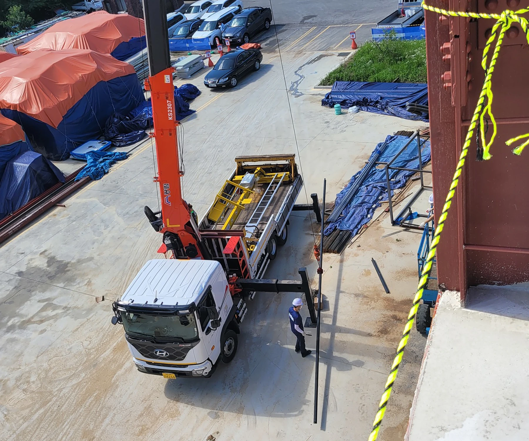
Sejong Hoist is a South Korean hoist crane specialist company that manufactures, installs, and maintains hoists and cranes.
The company is located in Daejeon, South Korea, but their customer base extends from Korean corporations and government to surrounding Asian countries.

Original

Refresh
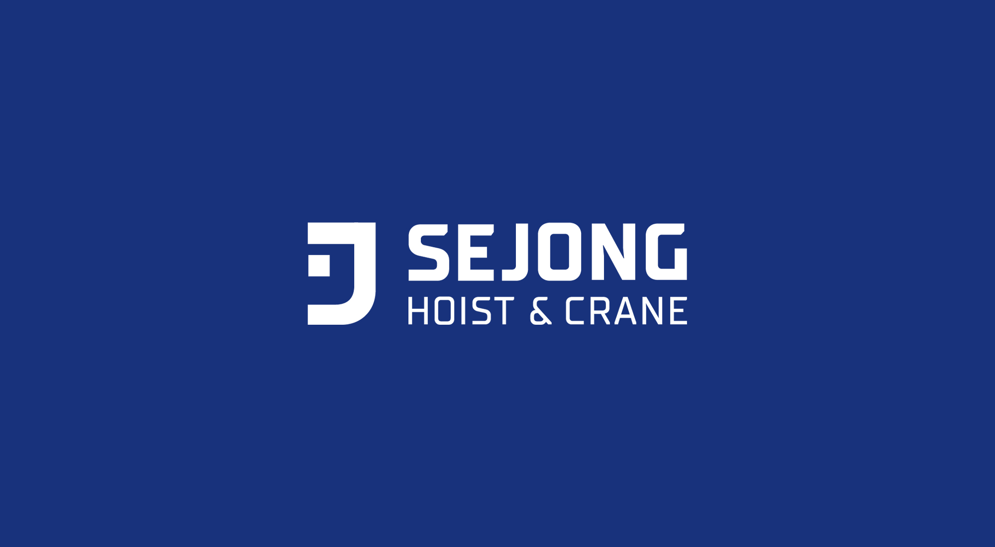
I collaborated with the client to redefine the company's image and values. Initially, I was asked to improve the harmony of Korean and English components. However, upon further research and discussion, I proposed a new direction utilizing just English in the logo.
While Hangul was originally designed to be written vertically, English was designed to be horizontal. Hangul has only been adapted to be written horizontally in the last 40 years (to accommodate technology) and its design hasn't fully caught up to this huge shift.
Because my client wanted a sleek and modern look to their logo, I recommended the use of an English logo.


In the original logo, the J resembles a crane.
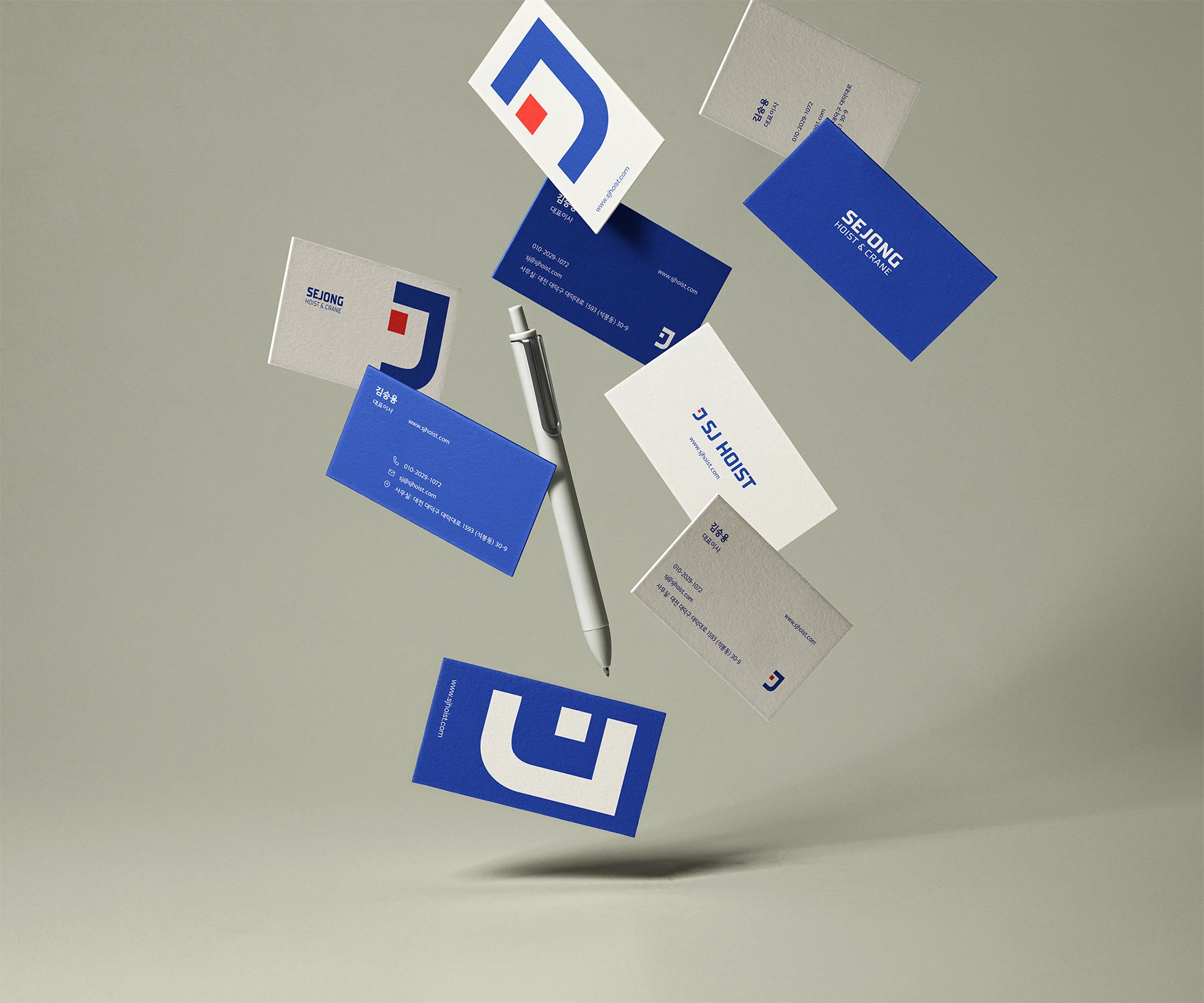
However, the connection of the S and J makes it less legible, so I simplified the symbol and made it separate from the name of the company.


